


Pika! One - Themes & Wallpaper
Pika! Studio
I installed Pika! One because I wanted to make my phone feel less static without replacing my launcher or rebuilding my entire home screen. It is a free personalization app from Pika! Studio that brings together animated visual elements for the lock and home-screen experience, including three-dimensional gravity wallpapers, charging animations, and Dynamic Island-style effects. That combination makes it more interesting than a wallpaper-only tool, although it also means the app is best judged as a collection of visual layers rather than as one complete theme system.
My starting point was a familiar one: the phone worked perfectly, but it looked exactly like every other Android device. I did not want a complicated customization project, and I did not want to spend time searching through separate wallpaper, charging-animation, and notification-effect apps. The appeal here is the chance to explore those ideas from one place. In daily use, I found that the app makes the most sense for someone who enjoys changing the phone’s mood in small, visible ways.
From a plain screen to a more animated phone
The app is listed in the Personalization category and has built a strong early audience, with a 4.7 average from around 3K ratings and more than 100K installs. It is free to start, carries an Everyone 10+ content rating, and supports Android 7.0 or later. The current version is 1.9.2, while in-app purchases range from $1.99 to $89.99 per item. Those details matter because the free entry point is inviting, but anyone who expects every visual option to be included automatically should approach it as a try-before-you-commit customization tool.
I began with the wallpaper area rather than activating every effect at once. That was the right choice. A gravity-style wallpaper can become the main visual identity of a phone, while charging and island animations are accents that appear only at particular moments. Looking at them separately makes it easier to decide whether the app is improving the phone or simply adding motion for the sake of motion.
The three-dimensional gravity concept is the most distinctive part of the experience. Instead of treating the wallpaper as a completely flat picture, it gives the background a sense of movement and depth as the device changes position. The effect is more noticeable when the image has a clear foreground and background, so I would not choose a visually crowded picture for this purpose. A simple image with one strong subject usually produces a cleaner result than a detailed scene full of tiny objects.
Related News

Why WhatsApp Messenger Still Makes Everyday Communication Feel Easy

Jurassic World: The Game Is the Better Dino Tycoon for Strategic Players

Threads in Real Life: Who Should Join, Lurk, or Leave

How SHEIN Turned Shopping Into an Endless Content Feed

How to Make Fortnite Feel Smarter on Mobile

Should You Switch to Microsoft Outlook on Mobile?
That is one of my first practical tips: choose the wallpaper for movement, not just for its still preview. A design that looks impressive in a thumbnail can become distracting once the phone is tilted repeatedly. Conversely, a quieter image can feel surprisingly polished when the depth effect gives it room to breathe. I found that the best outcome came from matching the animation to how I actually use the phone, rather than choosing the most dramatic option available.
Building the visual setup one layer at a time
After testing the background, I moved to charging animations. This is where the app changes from a passive wallpaper tool into something that participates in a specific phone routine. Plugging in the device is a short event, so the animation works best when it is easy to read immediately. I preferred effects that added a clear visual response without making the charging moment feel like a full-screen interruption.
A useful everyday scenario is arriving home with a low battery, placing the phone on the charger, and getting an unmistakable visual confirmation that the charging setup has been recognized. The animation does not change the battery itself, of course, but it gives that ordinary handoff a little more character. It is especially appealing if you charge the phone in the same place each evening and enjoy small rituals that make routine actions feel less mechanical.
Gallery
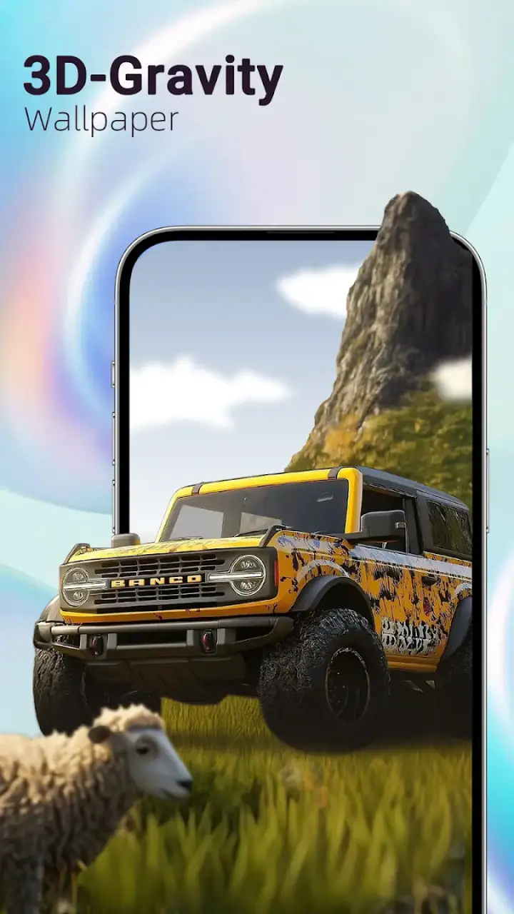
The Dynamic Island-style effects are a different kind of customization. They borrow the visual language of compact, floating status elements, which can make an Android phone feel more contemporary without requiring an iPhone-style interface. I see this as a novelty and presentation feature rather than a replacement for the phone’s actual notification system. The distinction is important: the effect can make an event look more engaging, but it should not be treated as a new control center or a guaranteed substitute for native system behavior.
That separation also helped me avoid a common mistake. I would not activate the most animated wallpaper, a busy charging effect, and a prominent island-style element at the same time unless I specifically wanted a very expressive look. Used together, they can compete for attention. A restrained combination usually looks more intentional: one animated background, a simpler charging treatment, and an island effect reserved for moments where it adds useful visual emphasis.
What happens when the app hands off to the phone
The interesting part of this type of personalization app is not only what happens inside its own screens. The real test comes when the selected design leaves the app and becomes part of the phone’s normal routine. A wallpaper has to remain pleasant after the novelty of setup disappears. A charging animation has to appear at the right moment. A Dynamic Island-style effect has to feel connected to the event it represents rather than floating on top of it without context.
In my experience, these handoffs are where expectations should stay realistic. Pika! One can supply the visual treatment, but the phone’s own interface rules still shape how that treatment is experienced. Different Android devices organize lock screens, charging screens, notifications, and overlays in different ways. Someone using a heavily customized manufacturer interface should therefore test one feature at a time before deciding that the whole app fits their device perfectly.
This is also why I would not recommend setting up everything immediately before an important trip, workday, or presentation. Spend a little time observing the phone after the change. Check whether the wallpaper remains comfortable during normal use, whether the charging effect feels too attention-grabbing at night, and whether the island-style visual clashes with the phone’s existing notifications. The app is easy to approach as entertainment, but the best results come from treating it like a small design project.
Another practical handoff involves sharing the phone with other people. A playful charging animation may be fun on a personal device, but it might not suit a work phone or a handset used by family members who prefer a quieter interface. I would keep the most expressive choices for a personal phone and use calmer designs on a device where readability and predictability matter more than visual flair.
How I would use it in a normal week
For a realistic routine, I would start on the weekend with the wallpaper only. I would use the phone normally for a day, including reading, messaging, navigation, and checking the lock screen, before adding another layer. On the next charging cycle, I would test the charging animation and decide whether it feels helpful or merely decorative. Only then would I try a Dynamic Island-style effect.
This staged workflow has a hidden benefit: it tells you which feature is actually improving the experience. If everything changes at once, it becomes difficult to know what caused visual fatigue or what made the phone feel more personal. By adding one element at a time, you can create a setup that reflects your habits instead of copying a preview image.
I would also keep a simple rotation in mind. A high-energy wallpaper may be enjoyable for a few days but tiring over a longer period, while a subtle depth design can remain comfortable for weeks. Charging animations are easier to rotate because they appear less often. That makes them a good place to experiment with bolder styles without committing the entire phone to constant motion.
The app is particularly well suited to users who like seasonal or mood-based changes but do not want to redesign icons, widgets, and launchers. A new wallpaper and charging effect can make the device feel refreshed in a few minutes. By comparison, a conventional launcher customization setup usually offers deeper control over grids, icons, folders, and widgets, but demands more time and can affect the way the phone is navigated. Pika! One is lighter in commitment and more focused on visual moments.
Where it is stronger than separate alternatives
The main advantage is concentration. Instead of moving between a wallpaper app, a charging-animation app, and an overlay-focused tool, I can explore related effects in one personalization experience. That reduces the initial effort and makes it easier to build a coordinated look. The app’s identity comes from the combination, not from any single category-leading tool hidden inside it.
It also has a different appeal from static wallpaper collections. A static image can be more efficient and may remain visually calm, but it does not react to movement or charging in the same way. Pika! One is for the person who wants the phone to feel responsive and expressive. If you enjoy seeing a visual reaction when you pick up, tilt, or connect the device, the extra motion has a clear purpose.
On the other hand, a dedicated wallpaper app may be better for someone who wants a large, carefully organized image library and nothing else. A launcher may be the better choice for deep layout control. A minimalist setup may be preferable if battery awareness, reduced distraction, or a clean professional appearance comes first. Pika! One sits between those options: more lively than a basic wallpaper picker, but less focused on complete interface redesign than a launcher.
The free price makes experimentation easy, but the purchase structure deserves attention. Because individual in-app items can reach $89.99, I would inspect what is included before buying anything and avoid assuming that a preview represents the full free selection. The app can be worthwhile without purchasing, especially if one or two available styles already suit you. If the free content does not match your taste, paying simply to unlock more motion will not solve a basic preference mismatch.
Where the flow breaks down
The first weakness is that visual novelty can outrun usefulness. A gravity wallpaper is enjoyable when noticed occasionally, but constant movement may become tiring for people who spend hours reading on their phone. Likewise, a charging animation can feel charming during the first few connections and unnecessary afterward. I would skip this app if you actively prefer still backgrounds and invisible system behavior.
The second limitation is the dependence on the phone around it. The app can present its own visual ideas, but Android devices differ in how they handle overlays, lock-screen presentation, charging states, and notification behavior. If your phone already uses a strong manufacturer theme or a crowded notification design, the added effects may not blend naturally. Testing the exact combination on your device is more valuable than relying on a screenshot from another handset.
There is also a practical trade-off between drama and clarity. The most noticeable animations are not always the easiest to live with. A bold effect can obscure the visual simplicity that makes a phone comfortable, particularly when checking the screen quickly in a dark room or during a busy day. My recommendation is to judge every selection by the question, “Will I still like seeing this several times a day?” rather than by how impressive it looks during setup.
People who need accessibility-first design should be cautious as well. Motion, layered effects, and decorative overlays may not be comfortable for every user. In that situation, a static background and the phone’s standard charging presentation may be a better fit. The app is aimed at visual customization, so its strongest qualities naturally matter less to someone who values minimal movement or maximum interface consistency.
Finally, the price range for optional items means the app rewards restraint. I would use the free experience as a filter: find out whether the style, pacing, and visual language suit you before spending money. The right purchase, if any, should solve a specific desire, such as finding a calmer background or a more suitable charging effect, rather than becoming an open-ended hunt through every available design.
Who should install it and who should pass
I recommend Pika! One to Android users who want a quick visual refresh, enjoy animated phone elements, and like the idea of combining depth wallpapers with charging and island-style effects. It is also a good match for someone who wants more personality than a standard wallpaper picker provides, but less commitment than a full launcher overhaul.
I would point a different way for users who want precise home-screen layouts, extensive icon packs, advanced widgets, or a completely distraction-free setup. A launcher or a carefully chosen static wallpaper tool will provide more control in those cases. The same is true for anyone who dislikes overlays or wants the phone’s native interface to remain visually untouched.
For everyone else, the best approach is gradual. Start with the background, observe how it behaves during ordinary use, then add the charging and Dynamic Island-style elements only if they complement the phone rather than compete with it. That workflow keeps the app’s strengths visible while reducing the chance that customization turns into clutter.
My final impression is positive but measured. Pika! One succeeds because it connects several small personalization moments into one accessible package. The three-dimensional wallpaper gives the strongest sense of identity, while charging and island-style animations make occasional interactions more playful. It is not a replacement for a launcher, and it is not the right answer for people who want absolute simplicity, but it is a convincing choice when you want your phone to feel more alive without rebuilding it from scratch.
With a 4.7 average, a free starting point, and support reaching back to Android 7.0, it is easy to try without turning the decision into a major project. I would keep expectations focused on visual atmosphere rather than deeper system control, test the handoffs on my own device, and spend carefully on optional items. Used that way, Pika! One feels less like a collection of flashy effects and more like a practical way to give an ordinary phone a personal rhythm.
FAQs for Pika! One - Themes & Wallpaper
What is Pika! One - Themes & Wallpaper?
Pika! One - Themes & Wallpaper is a customization app designed to give your phone a more personalized appearance. It typically combines wallpaper collections with themed visual elements, allowing users to refresh the look of their home and lock screens. Before downloading, check the current catalog, supported devices, and whether the available themes match your preferred Android or iOS style.
Is Pika! One - Themes & Wallpaper free to use?
The app may offer free wallpapers or theme elements, while additional designs, premium collections, or advanced customization options can require payment. I recommend reviewing the pricing information shown on the app’s store page before installing it. Also check whether subscriptions are included, how often billing occurs, and whether removing the app automatically cancels any active plan.
Does Pika! One change icons, widgets, or the entire phone interface?
The exact level of customization depends on the version of Pika! One and the operating system being used. Some themes may only provide wallpapers, while others can include matching icons, widgets, or visual suggestions. On iOS and Android, system restrictions can affect how deeply an app changes the interface, so users should not assume every theme creates a complete system-wide redesign.
Is Pika! One - Themes & Wallpaper safe to download?
Download the application only from the official Google Play Store or Apple App Store to reduce the risk of modified or unsafe copies. Before granting access, review the permissions requested and the developer information. A wallpaper app should not normally need unnecessary access to sensitive data. It is also worth checking the privacy policy to understand whether usage information or device data is collected.
Will using Pika! One affect battery life or phone performance?
Static wallpapers generally have little effect on battery life, but animated backgrounds, frequently refreshing content, widgets, or advertising may use additional power and memory. If your phone is older or has limited storage, monitor performance after applying a theme. Users who want maximum battery efficiency should choose static designs and disable unnecessary live effects or automatic wallpaper changes.
Pros
- Large collection of wallpapers and themes for different tastes.
- Simple browsing makes it easy to discover new visual styles.
- Regular content updates help keep the library feeling fresh.
- Many designs are suitable for customizing home and lock screens.
- Previewing artwork before applying it is quick and convenient.
Cons
- Some content may require payment or watching advertisements.
- Wallpaper quality and resolution can vary between designs.
- The app may request permissions users consider unnecessary.
- Heavy animated wallpapers can increase battery consumption.
- Some themes may work better on specific device models.


